A Thoughtful Transformation: Primary Suite + Guest Retreat Remodel
- KSIisgoodliving

- Feb 25
- 3 min read

Photo By: https://www.katefalconer.com/
At KSI, we get to overhaul clutter and chaos — transforming overwhelmed spaces into calm, intentional retreats. This recent residential remodel included a primary bedroom, primary bath, and guest room. What began as a series of disconnected rooms with awkward circulation and limited storage became a cohesive, elevated suite designed for comfort, beauty, and ease.
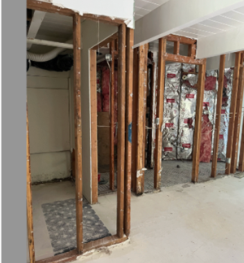
The Before: Tight Corners + Missed Opportunities
The original layout felt compartmentalized. The primary bath was tucked into an angular corner with minimal function. The closet space was undersized. The guest room doubled as a dressing room, creating congestion rather than calm.
Ceiling drops, limited lighting, and dated finishes made the spaces feel smaller than they were.


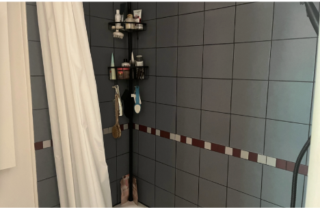


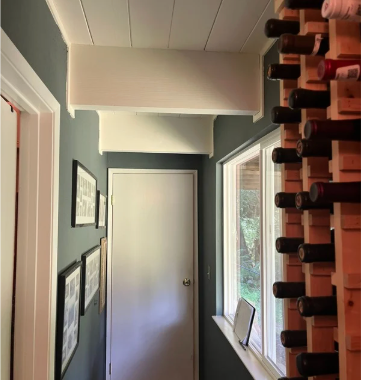
Before Floor Plan & before photos of primary bath.


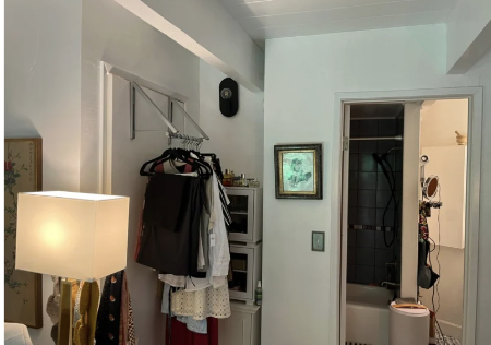

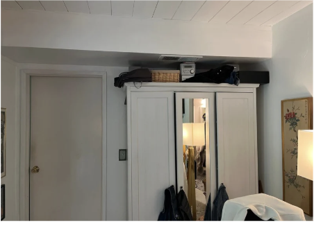

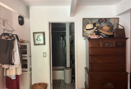
Before Floor Plan & before photos of primary bedroom.


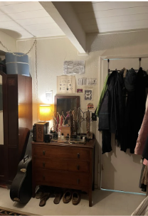

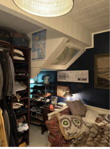

Before Floor Plan & before photos of guest bedroom/ closet and hall.
The home had wonderful bones — but it needed clarity and intention.
So we stripped it back. Literally.

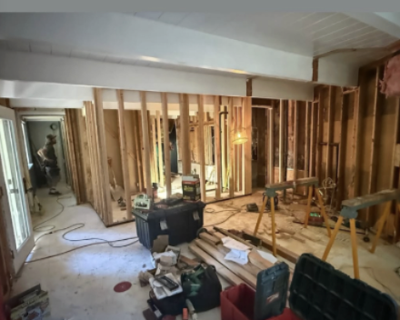


Photos of rough framing and sewer relocation.
Framing came down. Plumbing was reworked. Layouts were reconsidered from the ground up. And yes, we moved the sewer line in a concrete floor. WORTH IT!
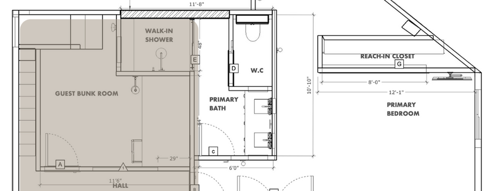
Reworking the Plan: Function First
The new floor plan tells a very different story.
A reconfigured primary bath with a custom double sink vanity.
A dedicated water closet.
A generous walk-in shower designed to feel clean, bright, and spa-like.
A newly carved-out reach-in storage closet for functionality without sacrificing aesthetics.
A defined guest bunk room that feels intentional, not leftover.
Every wall now serves a purpose. Circulation flows naturally. Storage is integrated, not added as an afterthought.
Good design is invisible — it simply works.
The Primary Bath: Warm Modern Contrast


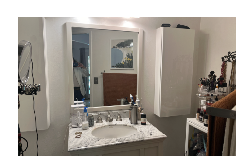
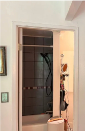
Proposed floor plan and after photos of primary bath. / Photo By: https://www.katefalconer.com/
In the bath, we leaned into warmth and texture.
Rich wood cabinetry grounds the room, paired with soft muted vertical tile for lightness and height. Brass plumbing fixtures introduce softness and a touch of polish without feeling flashy.
Open wood shelving adds practicality and warmth — a place for everyday objects to feel styled rather than stored.
The walk-in shower is minimal and bright, with clean lines and thoughtful detailing. The goal was spa energy — but approachable. Elevated, but not precious.
The Primary Bedroom: Soft, Layered, Inviting


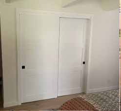


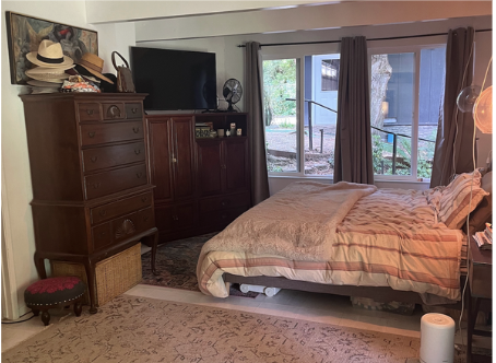
Proposed floor plan and after photos of primary bedroom. / Photo By: https://www.katefalconer.com/
The bedroom now feels expansive and calm. Soft patterned wallpaper creates movement without overwhelming the space. Warm neutral textiles — layered bedding, tailored drapery — bring depth. Integrated lighting adds glow at every layer: sconces, ambient light, natural light from the windows. It feels restful. Intentional. Collected. The reach-in closet was streamlined and built into the architecture so it disappears visually, allowing the bedroom to remain the focus.
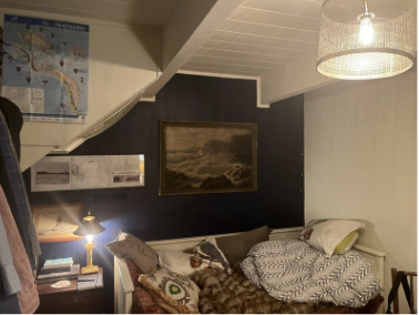
The Guest Bunk Room: Character + Comfort


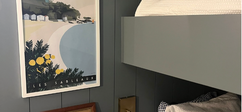

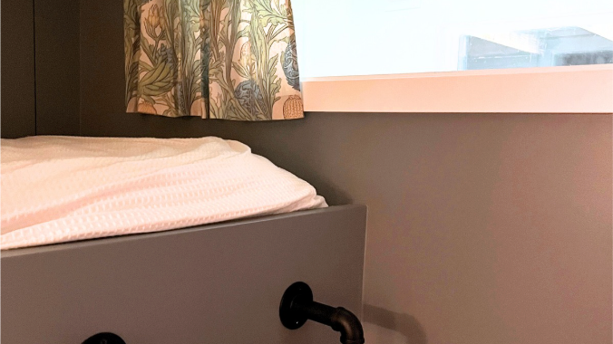
Proposed floor plan and after photos of guest bunk room.
What was once an undefined dressing room is now a cozy guest bunk room with personality.
Moody blue-green paneling adds depth and intimacy. Built-in bunks maximize space while feeling custom and architectural. Brass reading lights create warmth and a sense of permanence.
This room now feels like a retreat — not overflow space.
The Result: Cohesive + Livable
What makes this project special isn’t just the finishes — it’s the way the spaces now relate to each other. The primary suite feels like a true sanctuary. The bath works beautifully. Storage is intentional. Relocating the primary bath into the existing closet and guest room had a huge impact on redefining the overall feel and look in this home. The guest space has identity. This remodel was about clarity — stripping away what didn’t serve the home and rebuilding with purpose. Design should feel effortless. But it never happens by accident. Take a look of the side by side changes below.
Shop this design- Download the free shopping guide.


Comments